Introduction
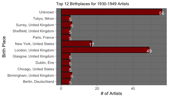
The project I chose to undertake was displaying the top 12 birthplaces for notable artists born from 1930-1949. With famous artists known for the photography, sculptures, paintings, and more, I was simply interested as to where they were from. Using the 1930-1949 artists dataset provided, I used R to clean my dataset by removal of columns and formatting them correctly, and eventually produced a graph that displayed the top 12 most common artist birthplaces. I was interested to see if certain countries or particular cities produced significantly more artists of this time than others, paving the way for future research and analysis in art history.
Sources
The dataset didn’t require much cleaning for my analyses. However, I had some minor tidying to do. For instance, I removed all of the unnecessary columns just so that I had a simpler dataset to view and work with. To finalize my initial data cleaning, I utilized a package for string manipulation to ensure that my birthplaces format was consistent throughout the dataset. For instance, to ensure that I didn’t have birthplaces entered with various formats (i.e. “New York, United States” v.s. “New-York, United States”), I removed pre-birthplace whitespaces, post-birthplace whitespaces, and symbols, leaving me with consistently formatted locations.
Process
After performing my initial cleaning of the data, I also made a column that grouped the artists by their birthplace, then counted how many artists were born at each listed birthplace. This group-counting method set up my x-axis for my visualization. Afterwards, I replaced what was considered the blank birthplace (if birthplace wasn’t listed in the original dataset, the entry remained blank and thus there were many blanks) with a birthplace of “Unknown”, as it was more appropriate when describing location. Then I narrowed down the dataset to only display the top 12 most popular birthplaces of artists at this time, priming the data for the graph I was interested in.
Presentation
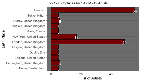
Knowing that I wanted to display the top 12 birthplaces of 1930-1949 born artists, I had to establish the cleanest yet informative methods to do so. Given that I had a numeric variable (counts of the number artists at each birthplace) and a qualitative variable (birthplace city and birthplace country), I knew that either a bar plot or box plot was needed. However, given that my numeric variable were counts for stagnant locations, I figured that a simple bar graph was needed. Thus using the ggplot package in R I prepared a bar graph to display the top 12 most popular birthplaces for the artists. Initially, with the typical bar graph of having my categorical variable on the x-axis, the birthplaces were difficult to read as they overlapped, so I adjusted the visual so that the x and y axes were flipped, placing my counts of artists at the x-axis and the birthplaces on the y-axis. Then I decided to improve the appearance of the graph, making it both easily readable and attractive. Thus, I colored the bars with a prominent red, outlining them in black to make their lengths even more distinguishable. Then I proceeded to change the background of the graph to a darker grey, adding some additional color to the graph. Next, I added appropriate axes labels and titles to convey exactly what I was showing in the graph. Finally, I added the count numbers of each birthplace onto the ends of each bar, making the number of artists born in each birthplace easily distinguishable for comparisons as simply comparing the bar length to the y-axis is sometimes challenging for comparisons between similar bars (i.e comparing a bar of length 5 to a bar of length 6).
Data Visualization
```{r}
ggplot(top12Artists, aes(x=Place, y=Number)) + geom_col(fill='darkred', color = 'black') + coord_flip() +theme_dark() + labs(title = "Top 12 Birthplaces for 1930-1949 Artists", x='Birth Place', y='# of Artists') + geom_text(aes(label = Number),position = position_dodge(.1),vjust=.8,size=4, color='white' ) + theme(plot.title=element_text(size=10))
```
Significance
This project showed me that there are numerous insights to be taken from my process and visualization. For instance, even though this data was relatively clean to begin with, it doesn’t hurt to take extra tidying/cleaning measures. For example, similar to how I removed all symbols and possible white space to make the format of the birthplaces consistent, even if a user doesn’t suspect it to be necessary initially, it doesn’t hurt to take the extra measure to ensure the data is consistent for future graphing or analysis. Also another insight that isn’t totally necessary but helpful is condensing a dataset if possible. Though I didn’t necessarily have to remove most of the columns to conduct my analysis and graphing, it doesn’t hurt to remove the unneeded aspects of the data. In the end, it made the dataset much easier to read and limited the possibility of me graphing or counting the wrong variables during my analysis. Though this project appears to be data science-related in many aspects, it is primarily related to Digital Arts & Humanities. Rather than maximizing a dataset’s potential for future statistical analysis (i.e keeping most of the columns), I chose to condense the data and graph as much as possible so that both the data and the accompanying visualization was easy to comprehend. Sometimes in data science, graphs and datasets are far too statistic-heavy for easy comprehension. Instead, in this Digital Arts & Humanities-focused project, I reminded myself that the goal was to produce not only a well-designed visualization, but also a visualization that was easily readable too. Rather than trying to incorporate statistics or often-confusing statistical visualizations in my graph, I chose the most comprehensible graph-type and designs to make my graph readable to any viewer, regardless of background.
